The Kelvin Illusion: Same Color, Different Truth
Two separate light fixtures can both be certified at exactly 2700K, yet render an interior space completely differently. One fixture renders rich walnut flooring, vibrant art, and healthy skin tones with striking natural warmth. The second fixture renders that exact same room looking lifeless, muddy, and strangely green. This disconnect is caused by poor color rendering fidelity.
Correlated Color Temperature (CCT) tells you only what color the bulb's emitted light appears when you look directly at it. It reveals nothing about which wavelengths are present inside that light beam to reflect off the walls, furniture, and fabrics in your home. If a color wavelength is missing from the light source, no object can reflect that color back to your eyes.
Decoding the CRI Standard (Ra 1 to 8)
The legacy Color Rendering Index (CRI / Ra) was developed in the 1960s to measure fluorescent tubes against incandescent references. It calculates the average color shift of just eight muted, pastel test swatches (R1 through R8). A manufacturer can produce a budget LED that renders these eight desaturated pastels adequately, scoring a passable "CRI 80," while missing large bands of the visible color spectrum.
For residential interior design, an 80 CRI rating is inadequate. Under an 80 CRI bulb, human skin tones look sallow, natural timber appears dull, and fresh meats or vegetables lose their rich color appeal. The baseline standard for all primary living spaces should always be at least CRI 90.
The Decisive R9 Value: Saturated Red
The standard CRI calculation ignores swatches R9 through R15. Among these, R9—measuring saturated red—is the single most important metric for residential interiors. Red wavelengths give skin its healthy vitality, reveal the true richness of wood grains, and bring depth to woven fabrics.
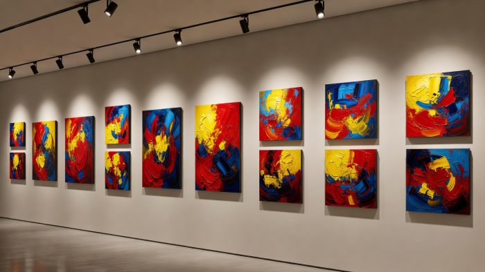
Cheap LED phosphor formulations intentionally cut corners on the R9 wavelength band because red phosphors require more power to generate, which lowers overall lumens-per-watt efficiency. Many common 80 CRI bulbs have an R9 rating hovering near zero—or even below zero in poor examples. High-performance architectural luminaires maintain an R9 rating of 50 or higher, with gallery-grade fixtures regularly exceeding R9 80.
| Metric Tier | General CRI (Ra) | R9 Saturated Red | Architectural Application |
|---|---|---|---|
| Basic Commercial | CRI 80 | R9: 0 to 15 | Parking bays, utility cupboards, warehouses only |
| Residential Standard | CRI 90 | R9: 50+ | Kitchen counters, living areas, bedroom suites |
| Museum / Architectural | CRI 95+ to 98 | R9: 85 to 95 | Art galleries, bespoke joinery, master bath vanities |
Beyond CRI: The TM-30 Fidelity (Rf) and Gamut (Rg) Standard
Because of the limitations of the legacy CRI system, the Illuminating Engineering Society (IES) developed the TM-30 standard. Instead of just eight pastel patches, TM-30 evaluates light against 99 real-world color samples, including human skin, natural foliage, textiles, and fine art pigments.
TM-30 provides two essential values:
- Fidelity Index (Rf): Measures how closely the light renders colors compared to an ideal reference source (similar to CRI, but far more thorough, scored from 0 to 100).
- Gamut Index (Rg): Measures color saturation. A score of 100 indicates natural saturation. Scores above 100 indicate heightened, more vibrant color pops; scores below 100 indicate washed-out, dull colors.
When selecting lighting for premium architectural projects, always check the photometric cut-sheet for TM-30 data: target an Rf of 90 or higher and an Rg between 98 and 104. This ensures colors look both accurate and naturally vibrant, regardless of your chosen Kelvin temperature.